Plotting
Scallops provides a comprehensive library of plotting functions focusing on the needs of optical pooled screens. All visualization tools reside within the module visualize, which in turn contains different sub-modules, following the structure:
visualize: The Module for visualization of OPS data.composite: Composite image visualization sub-module.crosstalk: Cross-talk analysis sub-module.distribution: Data distribution analysis Sub-module.heatmap: Heatmap generation sub-module.histogram: Histogram generation sub-module.imshow: Image display sub-module.napari: Napari interactive viewer sub-module.registration: Sub-module for registration visualization.segmentation: Sub-module for segmentation visualization.
There are also some utilities in the utils sub-module.
Below a showcase of some of the plotting functions available to you.
Load Experiment
Let’s first load an experiment to use in some of the plotting functions. To do that we’ll use SCALLOPS’ read_experiment function.
[1]:
from scallops.datasets import feldman_2019_small
from scallops.io import read_experiment  # Import the reading function

experiment_c_path = feldman_2019_small()

experiment = read_experiment(
    experiment_c_path / "input",
    "{prefix}/{mag}X_c{t}-{experiment}-{t}_{well}_Tile-{tile}.{datatype}.tif",  # Pattern that is followed by the images
    group_by=("well", "tile"),
)
experiment.images.keys()
[1]:
dict_keys(['A1-102', 'A1-103'])
This will load two tiles of well A1 of the experiment C (for more information on experiment C and SCALLOPS IO functions, refer to the data structures notebook and SCALLOPS’ API).
Composites
The first sub-module is the composite sub-module, which Provides functions for generating composite images from multi-dimensional imaging data. A composite image is a single visual created by combining multiple individual images or elements through layering, blending, and manipulation techniques. Is useful to visualize the channels as one image, or plot montages of them.
Image By Channel Montage
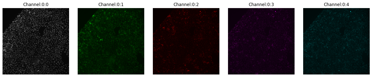
One of the first tasks when dealing with image data is to visualize a few tiles and check each channel separately. With SCALLOPS you can do this using the montage_plot function:
[2]:
from scallops.visualize.composite import montage_plot

montage_plot(experiment.images["A1-102"].isel(t=0))
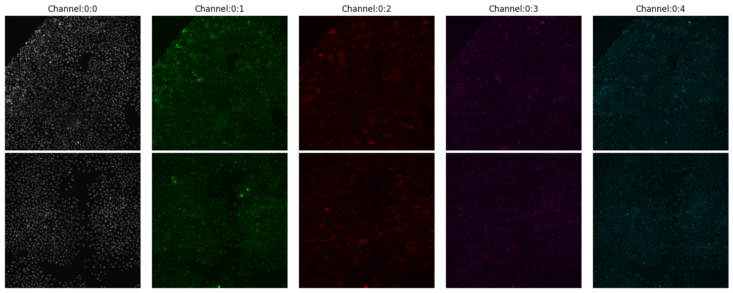
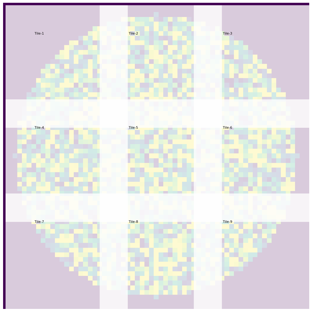
You can also directly plot the entire experiment with the same function, where each entry would be a row. In our example, experiment there are two tiles:
[3]:
montage_plot(experiment);
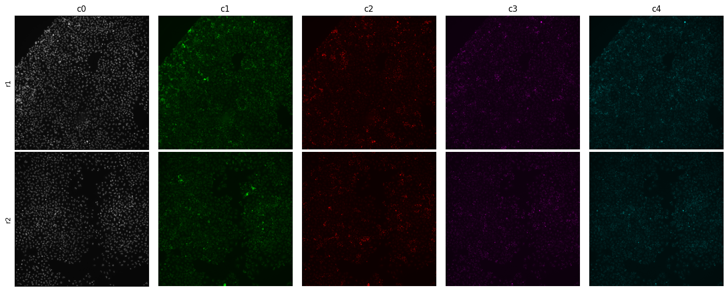
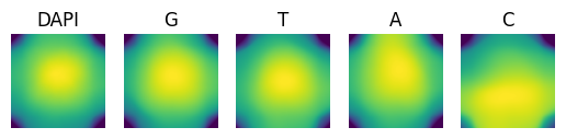
Now you probably notice that the title of the columns (channels) is not representative of the what they capture. Sometimes the metadata does not contain such information. For those cases you can customize the column and row titles:
[4]:
montage_plot(
    experiment,
    col_labels=["c0", "c1", "c2", "c3", "c4"],
    row_labels=["r1", "r2"],
);
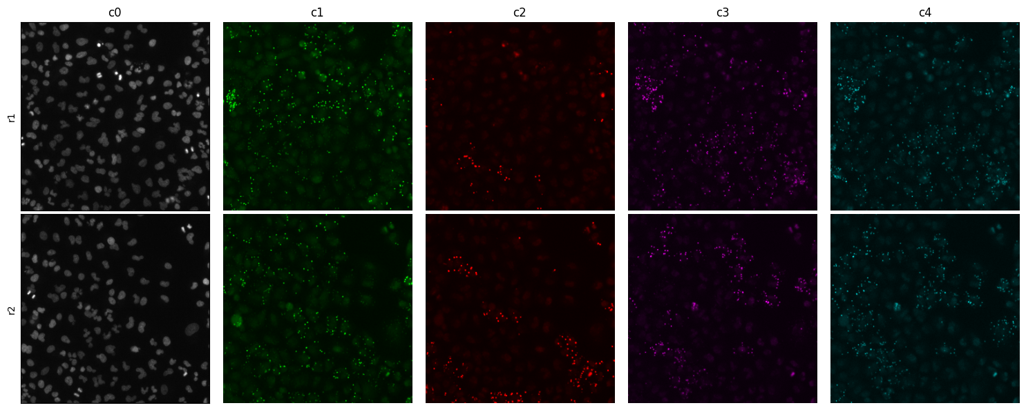
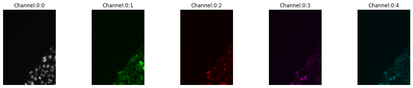
Sometimes you would like a closeup or crop. Let’s look at a 300 x 300 pixels crop at center of the tile
[5]:
montage_plot(
    experiment,
    col_labels=["c0", "c1", "c2", "c3", "c4"],
    row_labels=["r1", "r2"],
    crop=300,
)
Or you can crop any dimension (equal or less than the original image) quadrilateral, for example a rectangle of shape 20, 40, 200, 300:
[6]:
montage_plot(experiment.images["A1-102"].isel(t=0), crop=(20, 40, 200, 300))
One of the things that probably already crossed your mind is the contrast of each channel. Yes, with montage_plot you can specify the channel threshold by providing a dictionary mapping the channel and its range:
[7]:
montage_plot(
    experiment.images["A1-102"].isel(t=0),
    thresholds={"Channel:0:0": [288, 3000], "Channel:0:3": [100, 2000]},
)
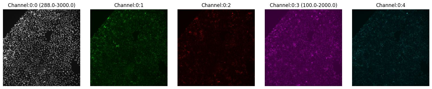
Here we modified channel 0 (to the range 288-3000) and channel 3 (to the range 100-2000), all other channels remain with the same contrast.
Composite of Multiple Channels
Now a true composite will blend the channels into one multichannel image. With SCALLOPS this can be achieved with the imcomposite function:
[8]:
from scallops.visualize.composite import imcomposite

imcomposite(experiment.images["A1-102"].isel(t=0, z=0), vmax=8000);
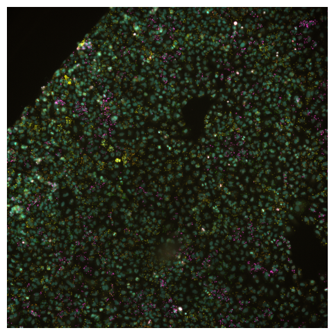
Is specially useful when checking channel alignment or markers co-localization. Similar to the montage_plot, you can also plot the entire experiment object, but in this case you have to use a different function experiment_composite:
[9]:
from scallops.visualize.composite import experiment_composite

experiment_composite(experiment, vmax=7000);
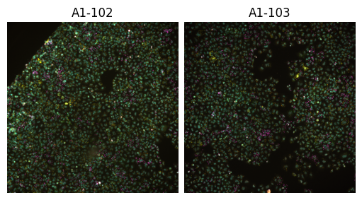
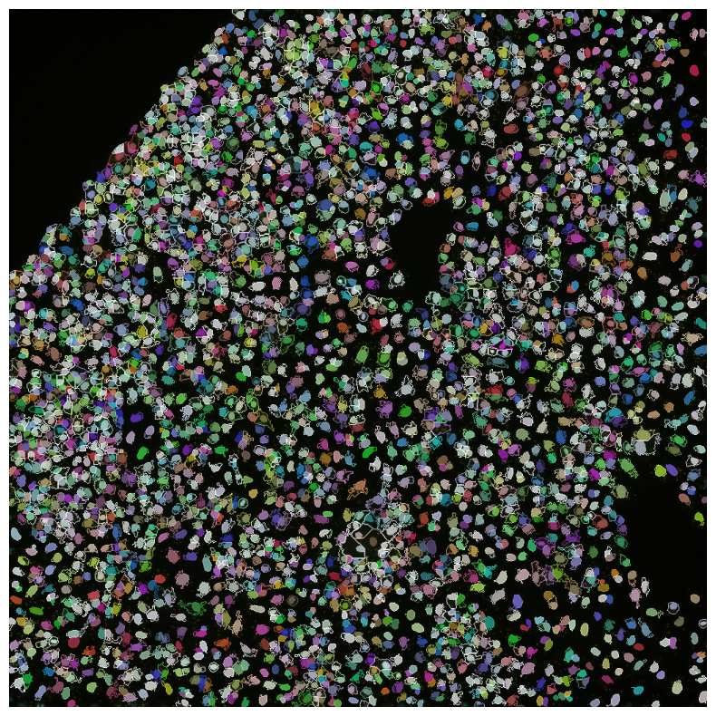
Both composite functions allow you to visualize labels as well.
[10]:
from scallops.registration.crosscorrelation import align_image  # Align channels
from scallops.segmentation.stardist import segment_nuclei_stardist
from scallops.segmentation.watershed import segment_cells_watershed

iss_image = align_image(
    experiment.images["A1-102"].isel(z=0),
    align_within_time_channels=[
        1,
        2,
        3,
        4,
    ],  # Ensure we align all channels within a cycle
    align_between_time_channel=0,  # Ensure we align all cycles
    filter_percentiles=[0, 90],  # reduces potential noise during aligning (is optional)
)
nuclei = segment_nuclei_stardist(image=iss_image)
cells, _ = segment_cells_watershed(
    iss_image, nuclei, threshold=650
)  # segment the cells
imcomposite(
    iss_image.isel(t=0),
    labels=nuclei,
    labels_contour=cells,
    labels_alpha=0.7,
    figsize=(10, 10),
    dim="c",
);
bioimageio_utils.py (2): pkg_resources is deprecated as an API. See https://setuptools.pypa.io/en/latest/pkg_resources.html. The pkg_resources package is slated for removal as early as 2025-11-30. Refrain from using this package or pin to Setuptools<81.
tf2onnx_lib.py (8): In the future `np.object` will be defined as the corresponding NumPy scalar.
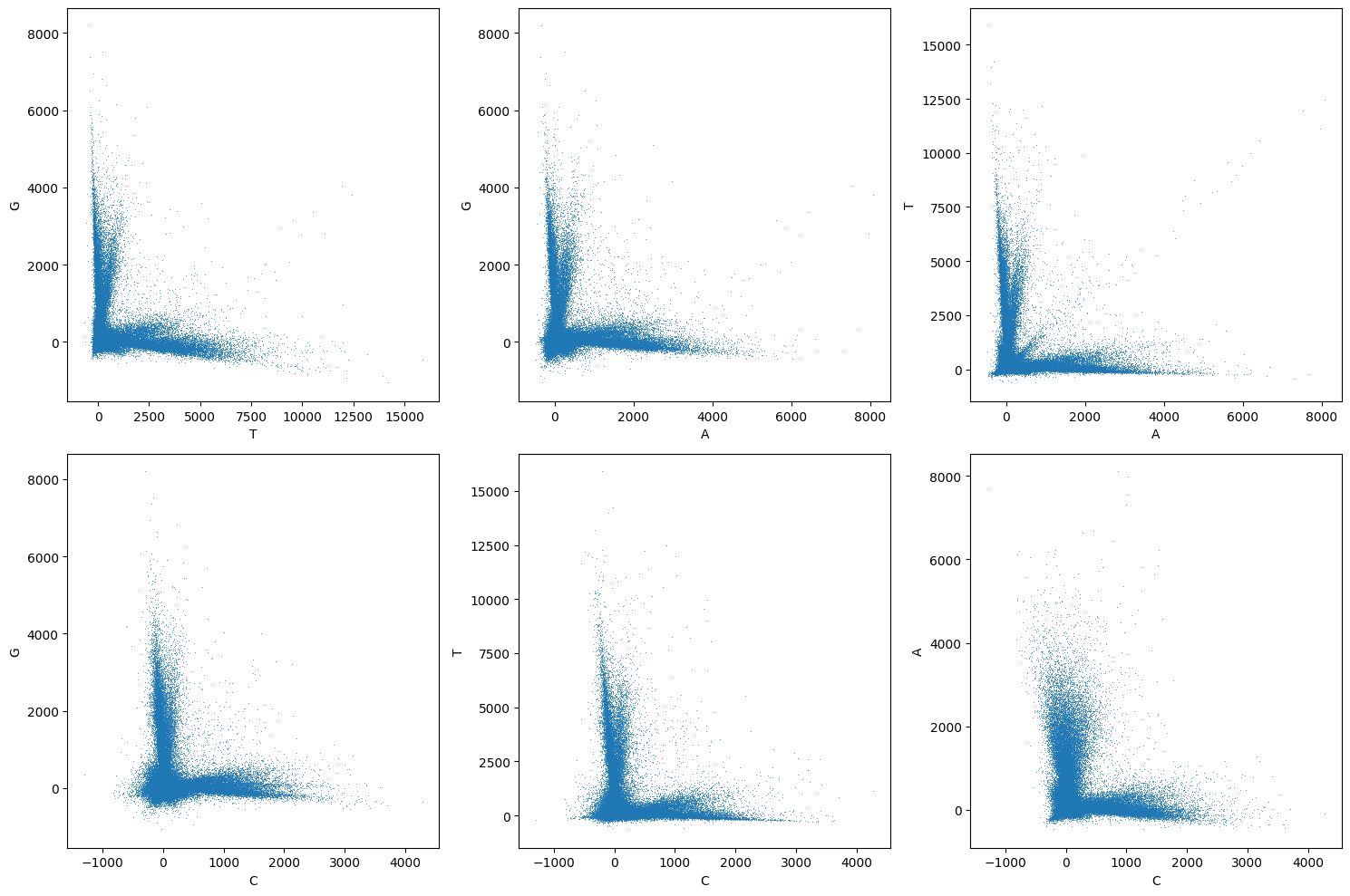
Crosstalk
When dealing with ISS data, often we want to determine the extent of cross-talk, and how it compares when then cross-talk have been corrected. This usually happens when we have estimated the barcode spots, and have call the bases. For this example lets use a Laplacian of Gaussian transform using SCALLOPS’ transform_log, followed by a standard deviation filter using SCALLOPS’s std and a max filter. To find the spots/peaks, we’ll use find_peaks. Once the filters have been applied and
the spots have been identified, we can call peaks_to_bases to estimate the bases array, and then assign the corresponding bases using xarray’s assign coordinates:
[11]:
from scallops.io import read_barcodes
from scallops.reads import (
    apply_channel_crosstalk_matrix,
    channel_crosstalk_matrix,
    decode_max,
    peaks_to_bases,
    read_statistics,
)
from scallops.spots import (
    find_peaks,
    max_filter,
    peak_thresholds_from_bases,
    peak_thresholds_from_reads,
    std,
    transform_log,
)

barcodes_path = experiment_c_path / "barcodes.csv"


df_barcode = read_barcodes(
    barcodes_path, iss_image.t.values - 1
)  # Read the barcodes using the actual t indexes (missing cycle 6)

loged = transform_log(iss_image.isel(c=[1, 2, 3, 4]))
std_arr = std(loged)
maxed = max_filter(loged)
peaks = find_peaks(std_arr)
bases_array = peaks_to_bases(maxed=maxed, peaks=peaks, labels=cells)


threshold_peaks_crosstalk_correction_df = peak_thresholds_from_bases(
    bases_array=bases_array
)
threshold_peaks_crosstalk_correction = threshold_peaks_crosstalk_correction_df.iloc[0][
    "threshold"
]

w = channel_crosstalk_matrix(
    bases_array.where(
        bases_array.peak > threshold_peaks_crosstalk_correction, drop=True
    )
)
corrected_bases_array = apply_channel_crosstalk_matrix(bases_array, w)


df_reads = decode_max(corrected_bases_array, barcodes=df_barcode)
peak_thresholds_lower_df = peak_thresholds_from_reads(df_reads.query("barcode_match"))
threshold_peaks = peak_thresholds_lower_df.iloc[0]["threshold"]
df_reads = df_reads.query(f"peak>{threshold_peaks}")
Now we can pass the bases array to the pairwise_channel_scatter_plot to visualize the cross-talk after correction:
[12]:
from scallops.visualize.crosstalk import pairwise_channel_scatter_plot

pairwise_channel_scatter_plot(corrected_bases_array);
Distribution
Once you have some features data extracted, you probably want to explore some of the distributional properties of said features. Let’s create some test data for demonstration:
[13]:
import numpy as np
import pandas as pd

treatments = ["test-1", "test-2"]
features_df = pd.DataFrame(data=dict(cell_mean_1=np.random.random(100)))
features_df["treatment"] = np.random.choice(treatments, size=len(features_df))
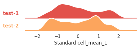
You want to compare their distributions with a ridge_plot, let’s say for mean intensity in channel 1 in cells:
[14]:
from scallops.visualize.distribution import ridge_plot

ridge_plot(
    features_df, scale="standard", feature="cell_mean_1", row="treatment", height=1
);
This plot allows you to visualize the percentage of reads that are exact matches given the read quality and the percentage of reads above said quality.
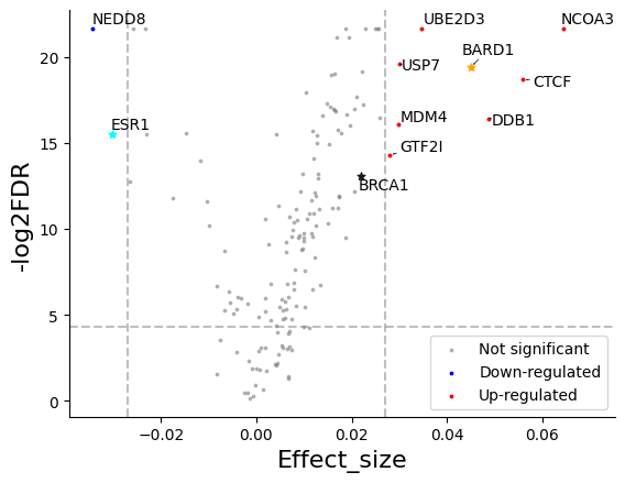
Volcano Plots
Once you have done your statistical testing you often end up with a summary statistics table that must contain (at least) a p-value and en effect size, like so:
[15]:
from scallops.datasets import example_feature_summary_stats

summary_stats = pd.read_parquet(example_feature_summary_stats())
summary_stats.head()
[15]:
| Gene | feature | Effect_size | p-value | FDR | -log2FDR | |
|---|---|---|---|---|---|---|
| 0 | AMBRA1 | nuclei_median_1_IF | -0.001392 | 8.505015e-01 | 8.595686e-01 | 0.151325 |
| 1 | AMD1 | nuclei_median_1_IF | 0.001324 | 4.759486e-01 | 5.108687e-01 | 0.671643 |
| 2 | ARID1A | nuclei_median_1_IF | -0.001909 | 6.049140e-01 | 6.325015e-01 | 0.458073 |
| 3 | BARD1 | nuclei_median_1_IF | 0.045101 | 1.764859e-10 | 3.701519e-09 | 19.414523 |
| 4 | BRCA1 | nuclei_median_1_IF | 0.021894 | 3.693842e-07 | 2.156258e-06 | 13.047136 |
Now you can visualize it with volcano_plot:
[16]:
from scallops.visualize.distribution import volcano_plot

volcano_plot(
    summary_stats.groupby("Gene").first().reset_index(),
    effect_size_col="Effect_size",
    ycol="-log2FDR",
    fdr_col="FDR",
    vbar_std=2,  # Adjust the standard deviation multiplier for vertical bars
    hbar_value=-np.log2(0.05),  # Adjust the horizontal line value for significance
    legend=("Down-regulated", "Up-regulated"),
    highlight="all",
    highlight_col="Gene",
    star=["ESR1", "BARD1", "BRCA1"],
);
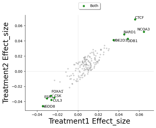
Comparative Effect Scatter
Sometimes you have multiple treatments in your data, and you which to compare the effect sizes of the hits. SCALLOPS have the comparative_effect_scatter to do such task. For this example let’s create and synthetically modify the summary statistics above:
[17]:
summary_stats2 = summary_stats.copy()
std_effect_size = summary_stats2.Effect_size.std()
std_log2FDR = summary_stats2["-log2FDR"].std()
summary_stats2["Effect_size"] += np.random.uniform(
    -std_effect_size, std_effect_size, summary_stats2.shape[0]
)
summary_stats2["-log2FDR"] += np.random.uniform(
    -std_log2FDR, std_log2FDR, summary_stats2.shape[0]
)
summary_stats2.head()
[17]:
| Gene | feature | Effect_size | p-value | FDR | -log2FDR | |
|---|---|---|---|---|---|---|
| 0 | AMBRA1 | nuclei_median_1_IF | -0.013502 | 8.505015e-01 | 8.595686e-01 | -1.922170 |
| 1 | AMD1 | nuclei_median_1_IF | 0.000196 | 4.759486e-01 | 5.108687e-01 | -0.171886 |
| 2 | ARID1A | nuclei_median_1_IF | -0.012429 | 6.049140e-01 | 6.325015e-01 | 0.646851 |
| 3 | BARD1 | nuclei_median_1_IF | 0.048346 | 1.764859e-10 | 3.701519e-09 | 18.869191 |
| 4 | BRCA1 | nuclei_median_1_IF | 0.021984 | 3.693842e-07 | 2.156258e-06 | 17.488955 |
Now we can use both summary statistics dataframes to plot the comparative effect:
[18]:
from scallops.visualize.distribution import comparative_effect_scatter

comparative_effect_scatter(
    df_x=summary_stats,
    x_label="Treatment1",
    df_y=summary_stats2,
    y_label="Treatment2",
    effect_size_column="Effect_size",
    colors=["green", "red", "blue"],
    grouping="Gene",
);
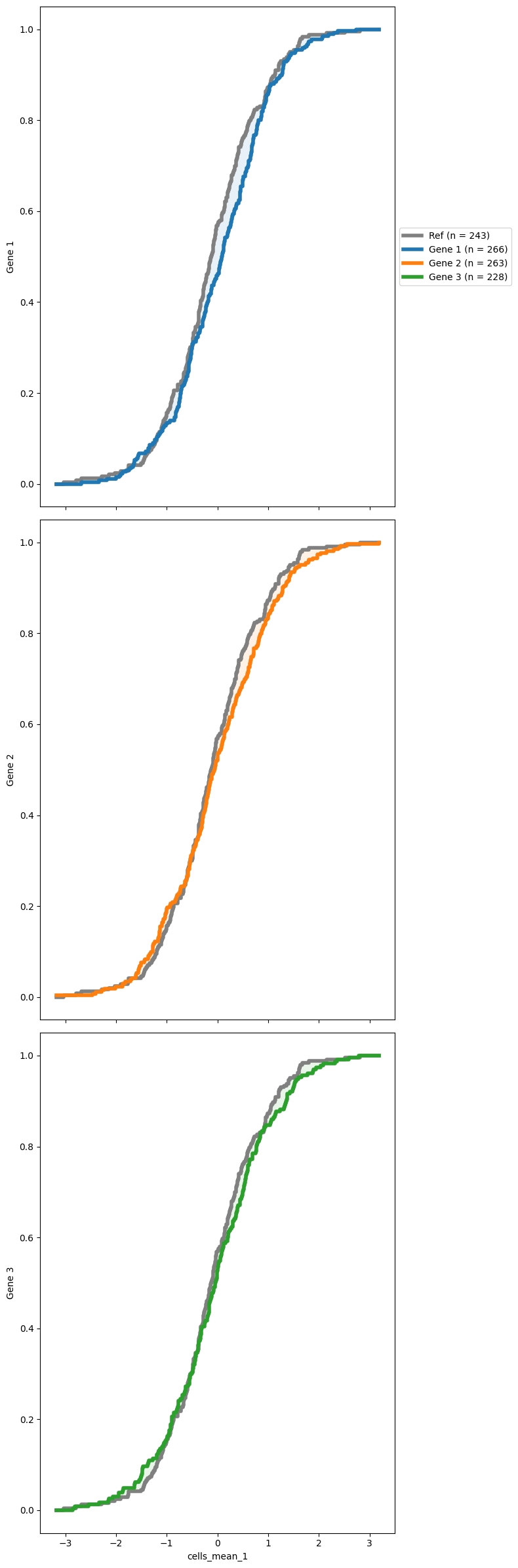
Comparative Cumulative distribution
You might also want to see how the reference distribution (often the NTCs distribution) compares with some other distributions. SCALLOPS have a cumulative distribution function plotting function, cdf_plot. To use this function you need to pass a reference group and a group of targets (both must exist in your data frame). The data must contain the original data from the features extracted, and the corresponding grouping (oftentimes genes):
[19]:
from scallops.visualize.distribution import cdf_plot

# Synthetic data for brevity
data = {
    "gene_symbol": np.random.choice(["Gene 1", "Gene 2", "Gene 3", "Ref"], size=1000),
    "cells_mean_1": np.random.normal(loc=0, scale=1, size=1000),
}
df = pd.DataFrame(data)

cdf_plot(
    df,
    groupby_column="gene_symbol",
    feature="cells_mean_1",
    reference_group="Ref",
    targets=None,
);
Heatmaps
Another important visualizatiob is heatmap of different features and caracteristics of the data. SCALLOPS sub-module heatmap contains a series of functions to do just that.
Plate Heat Maps
Often we want to be able to visualize the distribution of the features in the wells of a plate. So lets built some synthetic data on squared wells:
[20]:
wells = ["A1", "A2", "B1", "B2"]
well_tile_df = None
for well in wells:
    df = pd.DataFrame(data=dict(value=np.random.normal(0, 3, size=(7, 7)).flatten()))
    df["well"] = well
    df["tile"] = np.arange(len(df))
    well_tile_df = pd.concat((well_tile_df, df)) if well_tile_df is not None else df
well_tile_df = well_tile_df.set_index(["well", "tile"])
well_tile_df.head()
[20]:
| value | ||
|---|---|---|
| well | tile | |
| A1 | 0 | 1.240926 |
| 1 | 1.053209 | |
| 2 | 1.308024 | |
| 3 | -0.328345 | |
| 4 | 3.973495 |
now we can use the plate_heatmap to plot the column value spatially based on the tiles:
[21]:
from scallops.visualize.heatmap import plate_heatmap

plate_heatmap(df=well_tile_df, column="value");
Heatmaps in well shape
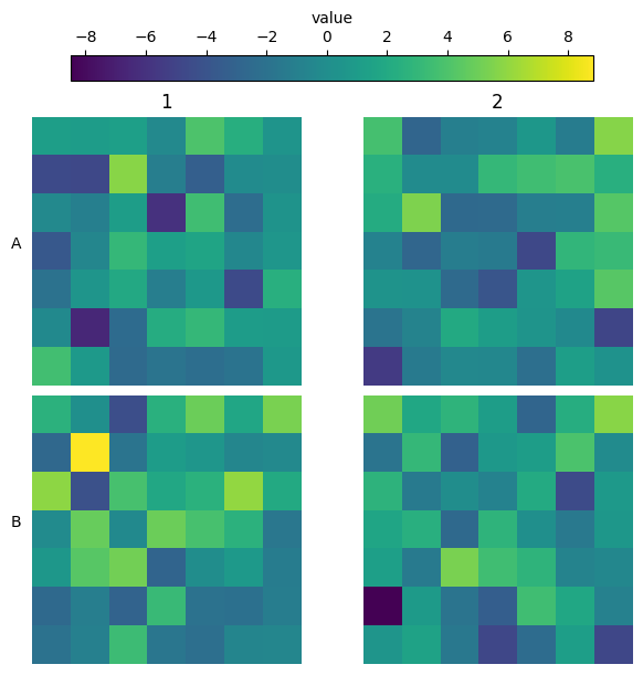
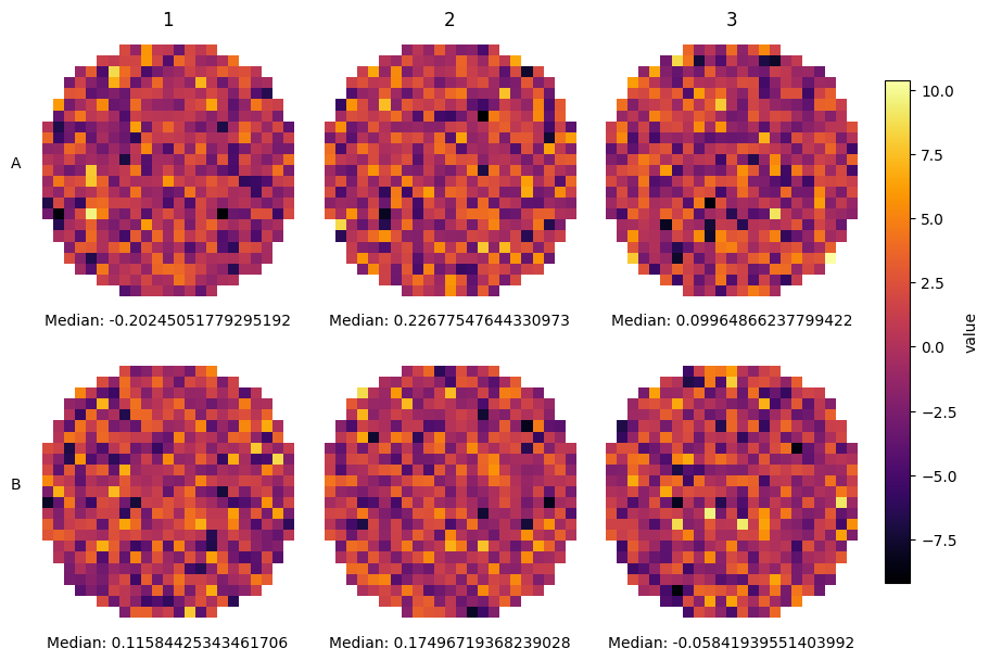
Sometimes you capture the entirety of the well, and you would like to show the shape of the well. Using plate_heatmap you can do this by passing the actual row structure of your well:
[22]:
wells = ["A1", "A2", "A3", "B1", "B2", "B3"]
well_tile_df = None
for well in wells:
    df = pd.DataFrame(data=dict(value=np.random.normal(0, 3, size=(25, 25)).flatten()))
    df["well"] = well
    df["tile"] = np.arange(len(df))
    well_tile_df = pd.concat((well_tile_df, df)) if well_tile_df is not None else df
well_tile_df = well_tile_df.set_index(["well", "tile"])
row_structure = [9, 13, 17, 19, 19, 21, 21, *[23] * 9, 21, 21, 19, 19, 17, 13, 9]
plate_heatmap(
    well_tile_df,
    column="value",
    tile_shape=(25, 25),
    cmap="inferno",
    colorbar_location="right",
    full_well=row_structure,
    overall_ann={"Median": np.nanmedian},
);
However, sometimes you do not know the row structure and you do not even have tile information (or you want to have a finer grained definition of the aggregation). For these cases SCALLOPS have the plot_well_aggregated_heatmaps function. To apply this function your dataframe must contain the x and y coordinates:
[23]:
from scallops.visualize.heatmap import plot_well_aggregated_heatmaps

# Create a fake 6 well plate

df = pd.DataFrame(
    data=dict(
        well=np.concatenate([np.repeat(well, 2000) for well in range(1, 7)]),
        value=np.random.uniform(0, 1, 6 * 2000),
        y=np.random.uniform(15, 9990, 6 * 2000),
        x=np.random.uniform(15, 9990, 6 * 2000),
    )
)
plot_well_aggregated_heatmaps(
    df=df,
    agg_function=np.mean,
    feature="value",
    grid_size=20,
    plate_shape=(2, 3),
    tile_size_x=500,
    tile_size_y=500,
    xlabel={"Median value:": np.nanmedian},
    cbar_label="Mean Value",
    x_col_name="x",
    y_col_name="y",
);
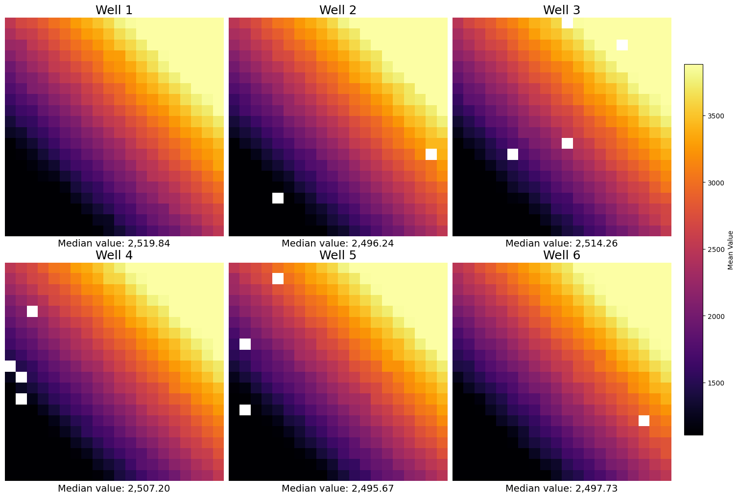
In real data, the grid size should match the grid size of the capture program.
Heatmap representing basecall mismatches
In ISS an important interrogation is the basecall mismatches. This allows you to determine the biases in the basecall, and make experimental adjustments accordingly. SCALLOPS provide the base_call_mismatches_heatmap function to visualize his bias in a heatmap format:
[24]:
from scallops.visualize.heatmap import base_call_mismatches_heatmap

data = {
    "whitelist_base": ["A", "A", "A", "C", "C"],
    "read_position": [1, 2, 1, 3, 2],
    "called_base": ["T", "A", "G", "C", "A"],
    "count": [5, 8, 2, 3, 7],
}
base_call_mismatches_df = pd.DataFrame(data)

# Generate the base call mismatches heatmap
base_call_mismatches_heatmap(base_call_mismatches_df);
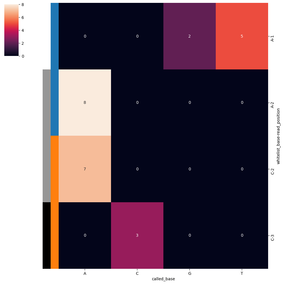
It returns a Seaborn ClusterGrid instance representing the base call mismatches heatmap.
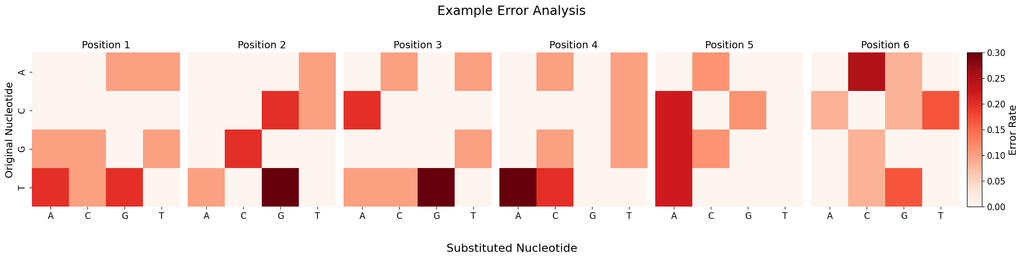
Heatmap of the mismatch correction
When using scallops pooled-sbs reads command with the option --mismatches it gives you (among other things) the original and corrected barcodes in the reads folder. You can explore the rates or counts of errors and mismatches by using the plot_barcode_errors function:
[25]:
import numpy as np
import pandas as pd

from scallops.visualize.heatmap import plot_barcode_errors

# Create synthetic data
np.random.seed(42)
nucleotides = ["A", "C", "G", "T"]

# Generate 100 barcodes of length 6
original = [
    "".join(np.random.choice(nucleotides) for _ in range(6)) for _ in range(100)
]

# Create uncorrected versions with some errors
uncorrected = []
mismatches = []

for barcode in original:
    # Introduce random errors
    result = list(barcode)
    errors = 0

    for i in range(len(result)):
        if np.random.random() < 0.1:  # 10% error rate
            options = [n for n in nucleotides if n != result[i]]
            result[i] = np.random.choice(options)
            errors += 1

    uncorrected.append("".join(result))
    mismatches.append(errors)

# Create DataFrame with the minimal columns needed
df = pd.DataFrame(
    {
        "barcode": original,
        "closest_match": original,
        "barcode_uncorrected": uncorrected,
        "mismatches": mismatches,
    }
)

# Analyze and plot
error_counts, fig = plot_barcode_errors(df, title="Example Error Analysis")
Processing errors: 100%|█████████████████████████████████████████████████████████████████████████████████████████████████████████████████████████████████| 49/49 [00:00<00:00, 207806.77it/s]
Total errors detected: 61

Errors by position:
Position 1: 10 (16.4%)
Position 2: 10 (16.4%)
Position 3: 10 (16.4%)
Position 4: 10 (16.4%)
Position 5: 9 (14.8%)
Position 6: 12 (19.7%)

Most common error types:
T→G: 10 (16.4%)
T→A: 9 (14.8%)
A→C: 6 (9.8%)
G→C: 6 (9.8%)
C→A: 5 (8.2%)
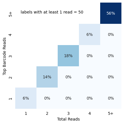
In-situ identity matrix
Once you have called all reads, you might have some false positives. One quick stop to see the quality of your basecall is to visualize identity matrix depicting cellular read distribution categorized by read identity. The matrix provides insights into the relationship between different read identity categories, particularly focusing on the total reads and top barcode reads. To do this you can pass the reads dataframe (a dataframe with at least barcode, barcode_count and barcode_match). For
traditional OPS (based in spot counts rather than intensity like perturbview), you can use the in_situ_identity_matrix_plot
[26]:
from scallops.visualize.heatmap import in_situ_identity_matrix_plot

data = {
    "barcode_match": np.random.choice([True, False], size=50),
    "barcode": [f"BC{i}" for i in range(1, 51)],
    "barcode_count": np.random.randint(1, 7, size=50),
}
data["barcode_count"] = [np.random.randint(count, 7) for count in data["barcode_count"]]
cells_df = pd.DataFrame(data)
in_situ_identity_matrix_plot(cells_df, xlabel="Total Reads", ylabel="Top Barcode Reads");
Histograms
SCALLOPS also have a few histogram plotting functions to make your exploration easier.
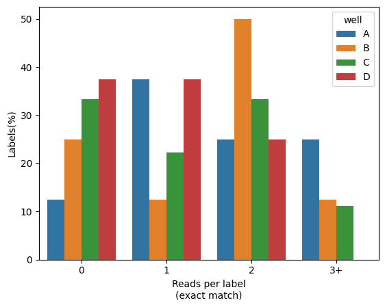
Percentage of reads with barcodes
You would like to more accurately quantify the percentage of cells (or any other label), and visually compare across a grouping value (e.g. well). For that SCALLOPS have the in_situ_barcode_hist_plot function
[27]:
from scallops.visualize.histogram import in_situ_barcode_hist_plot

data = {
    "well": np.random.choice(["A", "B", "C", "D"], size=100),
    "label": np.random.choice(range(1, 10), size=100),
    "barcode_match": np.random.choice([True, False], size=100),
}
reads_df = pd.DataFrame(data)
in_situ_barcode_hist_plot(reads_df, counts=[0, 1, 2, 3], hue="well", normalize=True);
Channel histogram
You might want to visualize how the intensity distribution compares across channels. You can achieve this by using SCALLOPS’ channel_hist_plot] function:
[28]:
from scallops.visualize.histogram import channel_hist_plot

# Plot histogram
channel_hist_plot(
    iss_image,
    binrange=(0, 3000),
    bins=100,
    height=8,
    aspect=2,  # Defaults to None, the data extremes,
);
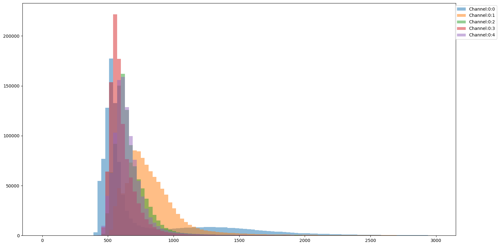
This way you can compare the distributional properties of the different channels with respect to one another.
Imshow
This sub-module provides functions for displaying images and overlays.
imshow_plane
The simplest of the imshow module functions is imshow_plane, which provides a way to visualize a 2D image array from an image stack:
[29]:
import matplotlib.pyplot as plt

from scallops.visualize.imshow import imshow_plane

# Plot the image using imshow_plane
fig, ax = plt.subplots()
imshow_plane(iss_image.isel(c=0, t=0), ax=ax, title="Example image", cmap="viridis");
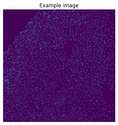
Note that imshow is a lot faster than the composite ones, but can only plot 2D images.
plot_plate
When you want to explore the entirety of the plate’s row images and you have the plate loaded in an experiment you can use the plot_plate function:
[30]:
import matplotlib.pyplot as plt
import numpy as np
import xarray as xr

from scallops.experiment.elements import Experiment
from scallops.visualize.imshow import plot_plate


def create_circular_well(shape, radius, center):
    """Create a circular well in an image."""
    y, x = np.ogrid[: shape[0], : shape[1]]
    distance = (x - center[1]) ** 2 + (y - center[0]) ** 2
    mask = distance <= radius**2
    arr = np.random.rand(*shape)
    return np.where(mask, arr, 0)


def generate_experiment(num_wells=6, well_shape=(65, 65), well_radius=30):
    """Generate a synthetic experiment with circular wells."""
    images = {}
    for i in range(num_wells):
        center = (well_shape[0] // 2, well_shape[1] // 2)
        well = create_circular_well(well_shape, well_radius, center)
        # Use a format like "A01-01" for well identifiers
        row = chr(65 + i // 3)  # A, B
        col = (i % 3) + 1  # 1, 2, 3
        # Add dummy dimensions for compatibility
        well = xr.DataArray(well, dims=["y", "x"]).expand_dims(c=[0], t=[0], z=[0])
        images[f"{row}{col}-01"] = well

    return Experiment(images=images)


# Generate the experiment
exp = generate_experiment()

# Plot the 6-well plate
fig = plot_plate(exp, plate_shape=(2, 3), well_shape=(1, 1), vmax=1, vmin=0)
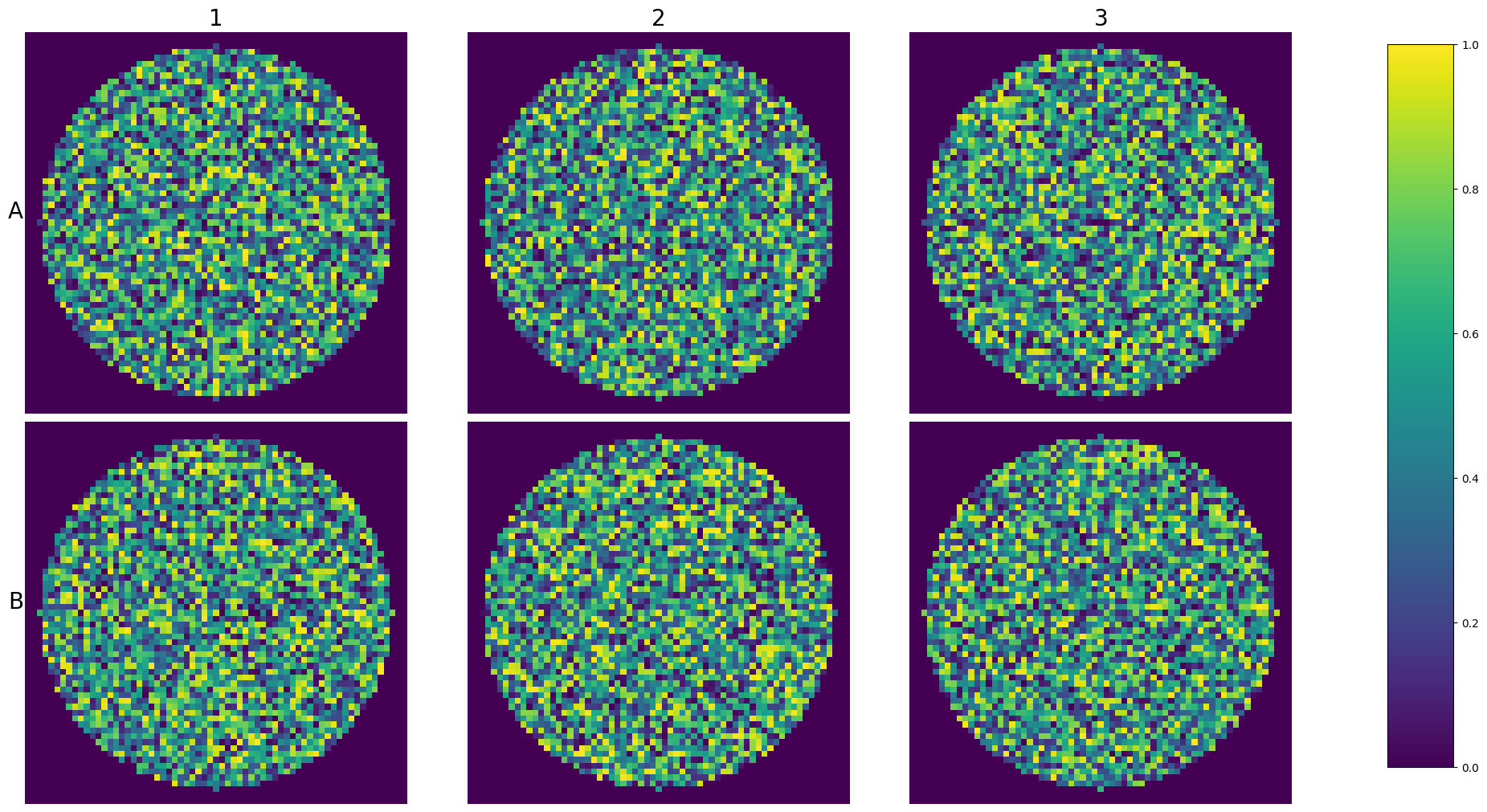
This way you wan visualize an entire experiment at once.
tiles_over_stitch
Since SCALLOPS deals with stitched tiles, you sometimes want to overlay the stitching to the well. For this purpose you can use tiles_over_stitch function:
[31]:
from collections import defaultdict
from itertools import product

from scallops.visualize.imshow import tiles_over_stitch


def create_stitched_coords(image: xr.DataArray, grid_shape=(3, 3), overlap=0.2):
    """Create a DataFrame with stitched coordinates for a grid of tiles with overlap."""
    img_height, img_width = image.sizes["y"], image.sizes["x"]
    tile_height, tile_width = (
        int(img_height / grid_shape[0] * (1 + overlap)),
        int(img_width / grid_shape[1] * (1 + overlap)),
    )
    step_y, step_x = int(tile_height * (1 - overlap)), int(tile_width * (1 - overlap))
    data = defaultdict(list)
    for row, col in product(range(grid_shape[0]), range(grid_shape[1])):
        tile_id = f"Tile-{row * grid_shape[1] + col + 1}"
        x = col * step_x
        y = row * step_y
        data["Tile"].append(tile_id)
        data["X"].append(x)
        data["Y"].append(y)
        data["XSize"].append(tile_width)
        data["YSize"].append(tile_height)

    return pd.DataFrame(data)


well = exp.images["A1-01"]
stitched_coords = create_stitched_coords(well)
fig, ax = tiles_over_stitch(well, stitched_coords)
Now you can see where the overlap is (in this case 20%), where the tiles lay, etc.
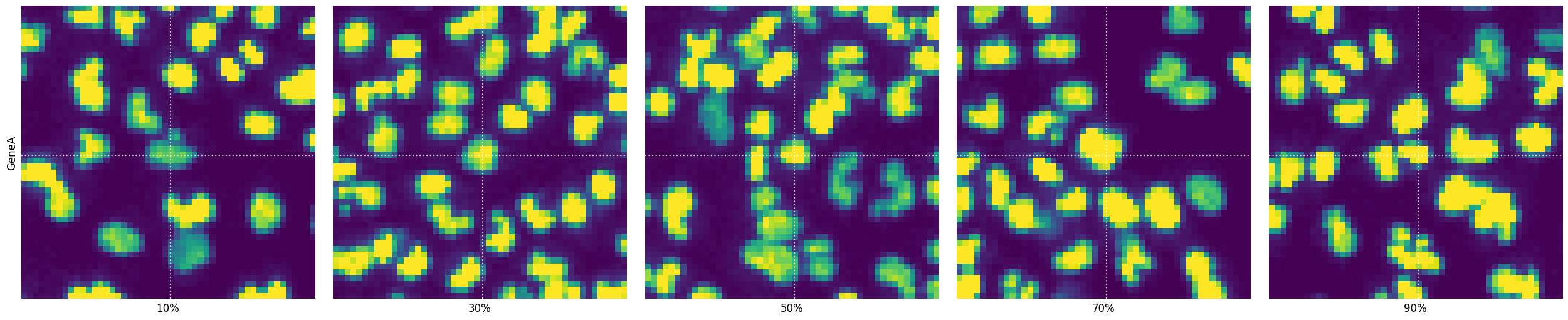
plot_percentile_montage
Often you want to see some cells on a specific phenotype value percentile in a montage of gene-specific images. For this SCALLOPS provides the function plot_percentile_montage, which creates a montage of images for specified genes, displaying representative cells at given percentiles of a specified feature:
[32]:
from skimage.measure import regionprops_table

from scallops.visualize.imshow import plot_percentile_montage

image = iss_image.isel(t=0).squeeze()
label = xr.DataArray(nuclei, dims=["y", "x"])
props = pd.DataFrame(
    regionprops_table(
        label.data,
        image.isel(c=0).data,
        properties=["label", "centroid", "intensity_mean"],
    )
)
props["Gene"] = "GeneA"
props = props.rename(
    columns={
        "centroid-1": "nuclei_centroid-1",
        "centroid-0": "nuclei_centroid-0",
        "intensity_mean": "intensity_mean_0",
    }
)
genes_to_plot = ["GeneA"]

fig, selected = plot_percentile_montage(
    props,
    genes_to_plot,
    image,
    group_by=["Gene"],
    gene_name_col="Gene",
    feature="intensity_mean_0",
    guide_lines=True,
    context=True,
)
Napari
For interactivity, SCALLOPS have implemented the napari viewer with some very useful features
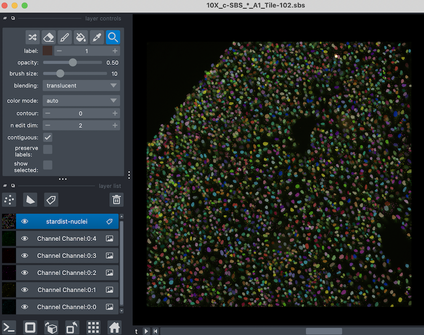
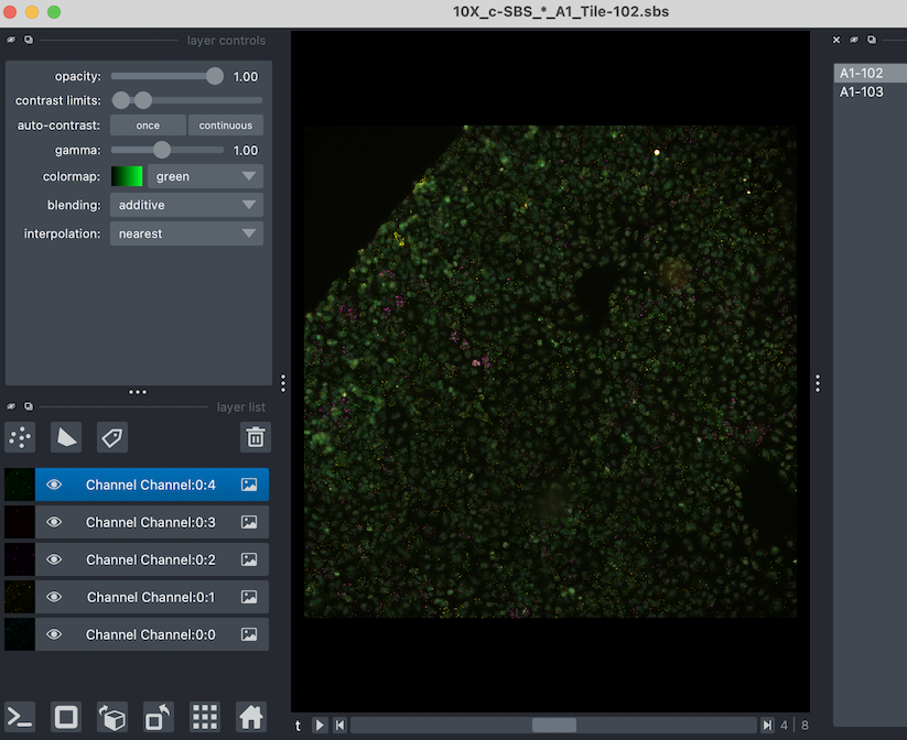
View Image In Napari
First, lets create the viewer using imnapari. Since this is interactive, it will open a second window for you. You call the viewer like so:
[33]:
from scallops.visualize.napari import imnapari

viewer = imnapari(
    experiment.images["A1-102"],
    labels={"stardist-nuclei": nuclei},
)
The viewer should open in a second window, looking something like this:
View Experiment In Napari
Now, if you have an experiment, you might not want to open multiple windows. SCALLOPS Experiment can be explored using the experiment_napari function:
[34]:
from scallops.visualize.napari import experiment_napari

viewer = experiment_napari(experiment)
It should open a window that look like this:
were you can toggle between tiles (or any groups) you have in your experiment.
Explore base calls
One of the cornerstones of OPS is a good base calling. Verifying the calls is not easy, and therefore SCALLOPS added a function to make the visual inspection a bit easier. It takes the viewer (for a single image) and adds bases to it, so you can explore it. The function is called add_bases:
[35]:
from scallops.visualize.napari import add_bases, imnapari

viewer = imnapari(
    iss_image,
)
points = add_bases(viewer, df_reads)
A zoomed area should look like this:
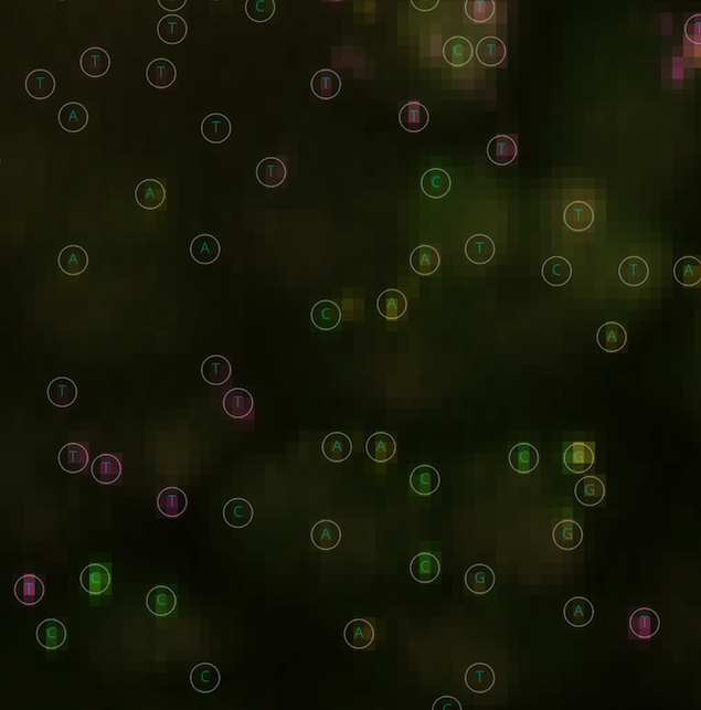
Where each base call would be overlayed to the ISS data, and the cycles can be changed accordingly to do the basecall by eye.
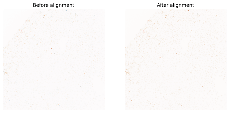
Visualize registration
After alignment, you might want to make sure the registration was successful. To that effect, SCALLOPS provides a set of functions to help you visualize the registration.
diagnose_registration
This function overlays 2-d images from an alignment of images. Given colormap restriction, the diagnose_registration can handle a maximum of six images, showing each image in a different color, helping visualize miss-alignments:
[36]:
from scallops.visualize.registration import diagnose_registration

f, axs = plt.subplots(ncols=2, figsize=(10, 6))
# Plot the registration diagnosis
selectors = [
    {"t": 1, "c": "Channel:0:0"},  # DAPI in first cycle
    {"t": 1, "c": "Channel:0:1"},  # G in first cycle
    {"t": 1, "c": "Channel:0:2"},  # T in first cycle
    {"t": 1, "c": "Channel:0:3"},  # A in first cycle
    {"t": 1, "c": "Channel:0:4"},  # C in first cycle
    {"t": 2, "c": "Channel:0:0"},  # DAPI in second cycle
]
axes = diagnose_registration(
    experiment.images["A1-102"].squeeze(),
    *selectors,
    title="Before alignment",
    ax=axs[0],
)
axes = diagnose_registration(
    iss_image,
    *selectors,
    title="After alignment",
    ax=axs[1],
)
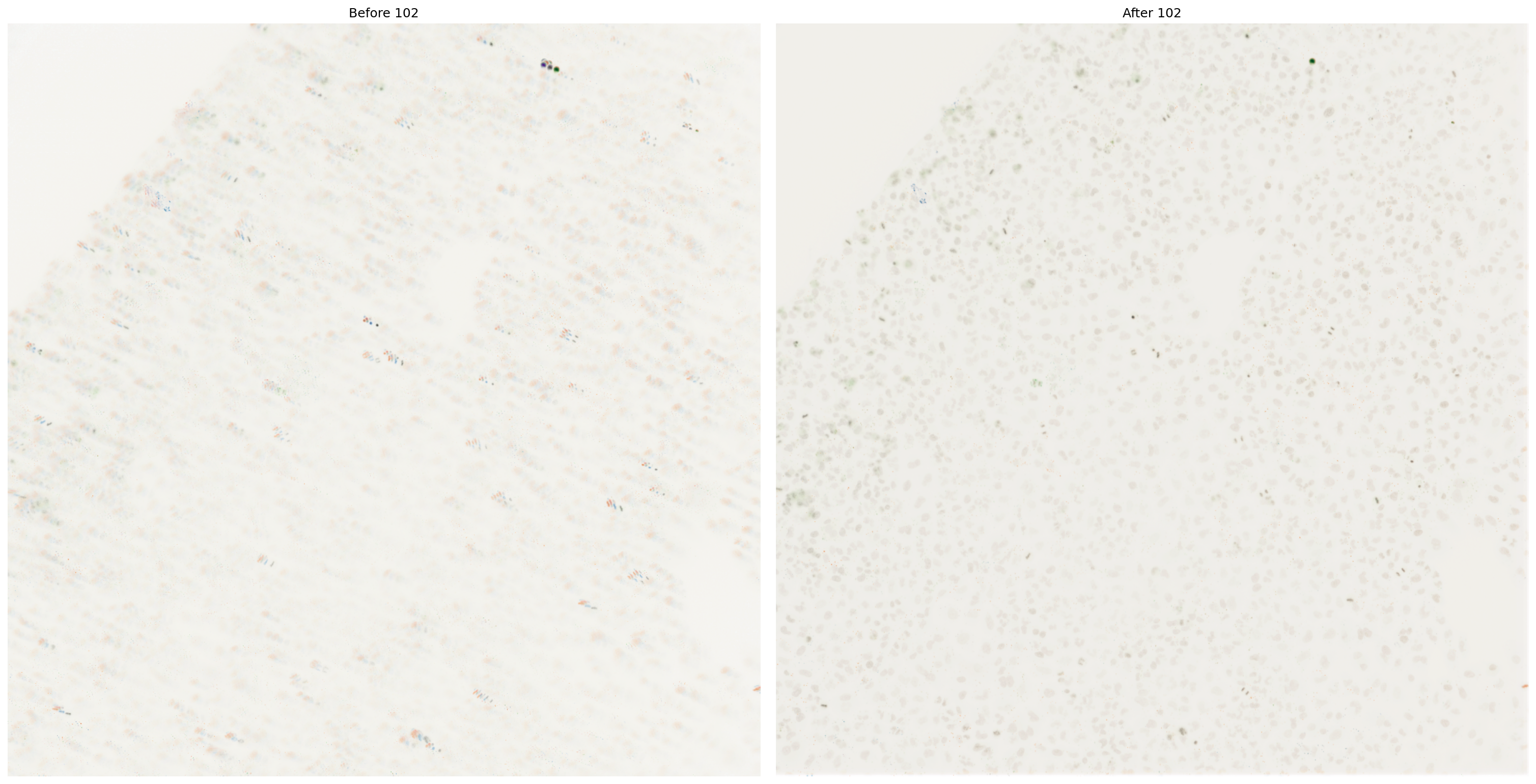
plot_registration
Another way to check stacks is to plot the side by side, and to plot more registrations at once. For this, you can use plot_registration:
[37]:
from scallops.visualize.registration import plot_registration

stacks = [
    experiment.images["A1-102"].squeeze(),
    iss_image,
]

# Plot the registration results
axes = plot_registration(
    stacks,
    dpi=150,
    titles=["Before 102", "After 102"],
    plot_cols=2,
    figsize=(20, 20),
    layout="constrained",
)
Segmentation
Helping the visualization of the segmentation results, SCALLOPS provides the function plot_segmentation:
[38]:
from scallops.visualize.segmentation import plot_segmentation

# Plot segmentation results
plot_segmentation(
    data=[nuclei, cells],
    dpi=150,
    titles=["Nuclei", "Cells"],
    fontsize=12,
)
dtype.py (529): Downcasting int32 to uint16 without scaling because max value 2968 fits in uint16
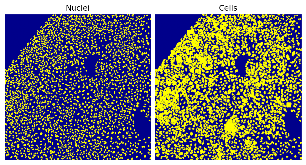
This is an easy and quick check of the segmentation. Note that the composite’s and napari’s functions also have label plotting functionalities that expand that of this module.
[4]:
The image ends with .ome.tiff, which might indicate an OME-TIFF file format. You might want to install the `bioio-ome-tiff` plug-in for improved metadata Processing.You can also use 'bioio.plugin_feasibility_report(image)' method to check if a specific image can be handled by the available plugins.
[ ]: